December 18, 2023
The Power of Typography: Choosing Fonts That Speak Your Brand
FER JIMENEZ - CREATIVE DIRECTOR

It’s no secret that typography has a huge role in conveying the personality and tone of a brand. For me, typography is the unsung hero of brand communication, acting as the brand’s ambassador, translating its essence into even the simplest of documents. Let’s talk about the key elements of choosing the best font for your brand.
Understanding Typeface Basics: Serif vs. Sans Serif and Font Families
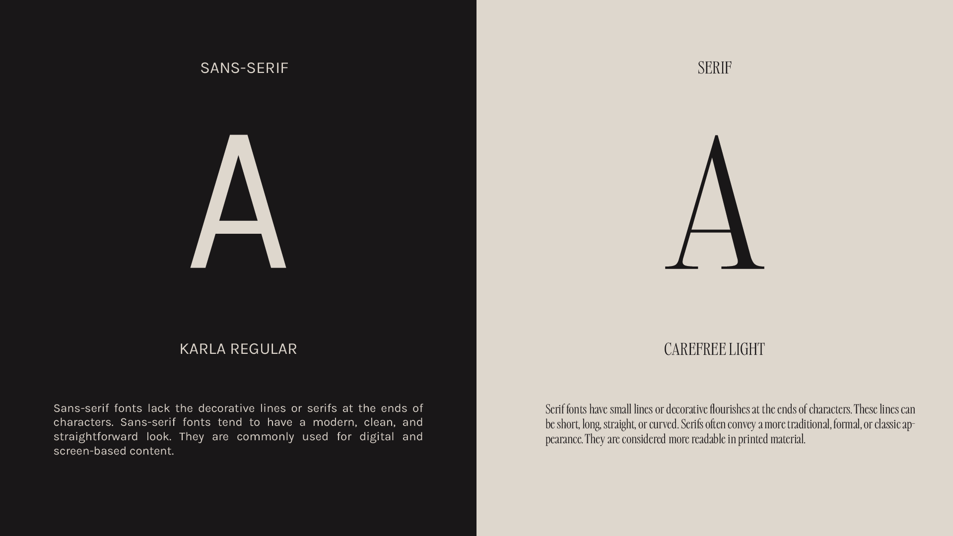
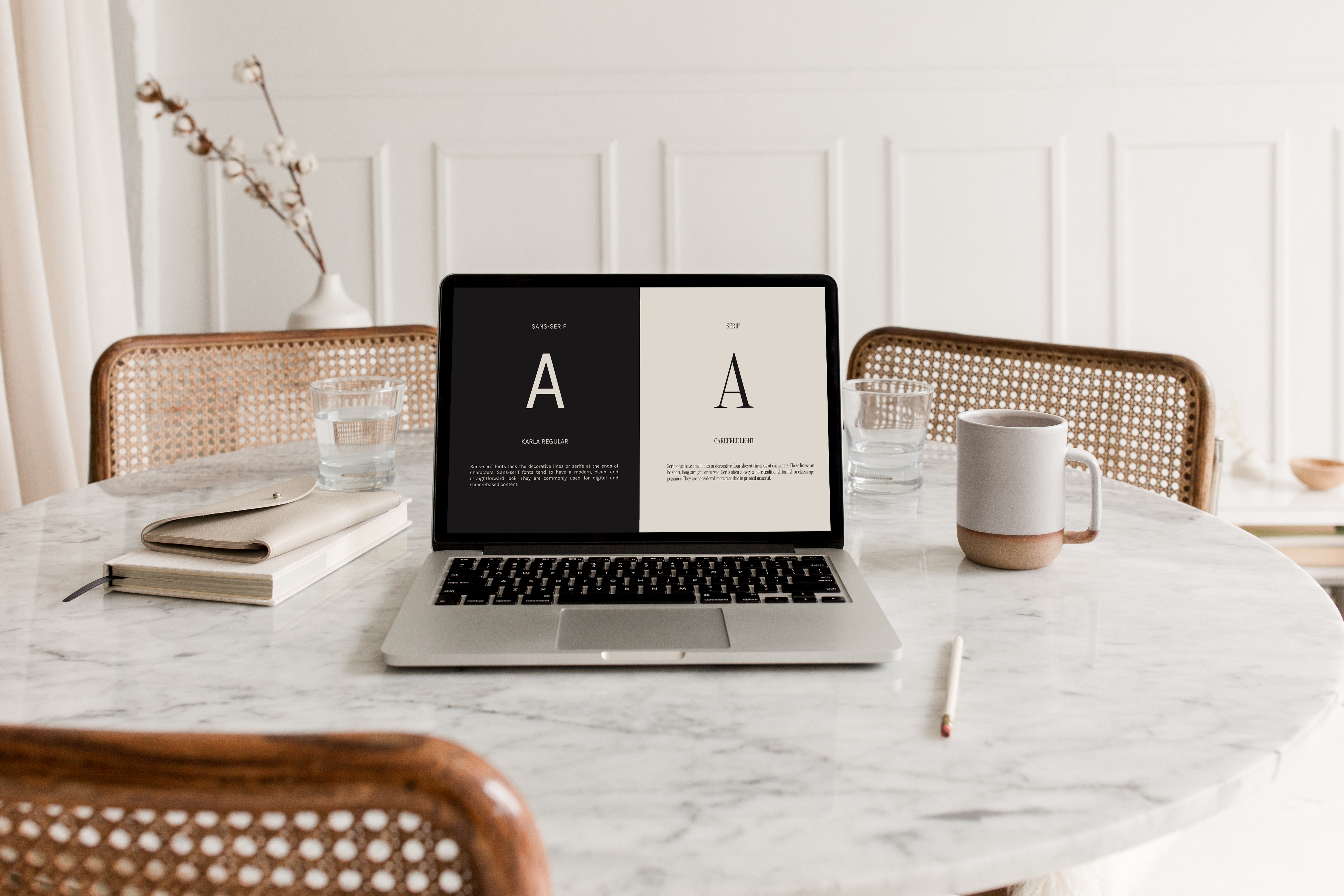
Typography basics begin with understanding the fundamental concepts of Serif vs. Sans Serif and the significance of Font Families. Serifs bring a touch of sophistication, while Sans Serif exudes modernity. Font families, on the other hand, play a pivotal role in influencing readability and overall visual appeal.
Analyzing Brand Personality: Fonts as Living Characters
In my world, brands aren’t just entities; they’re living, breathing characters with distinct personalities. To select the perfect typography, I list down a brand’s traits and quirks, creating a vivid picture of its personality.

Font’s Shape: Finding the Perfect Match
Fonts, like shapes, carry specific characteristics. A lively, playful font mirrors a fun and youthful brand. It’s all about finding a font personality that harmonizes seamlessly with your brand’s unique character.
Practical Font Selection: Beauty Meets Functionality
While aesthetics are crucial, practicality is equally vital. Hierarchy and readability take center stage in font selection, and mastering the art of font pairing ensures a harmonious and dynamic visual impact.
Staying Timeless Yet Modern: The Art of Balance
Balance is the key to choosing a font that stands the test of time while embracing contemporary trends. Evolving with a brand without losing its essence is the mark of a truly exceptional font.
Choosing a font is like shopping for a friend – it might seem daunting, but it’s a creative endeavor and a chance for brand expression. Embrace the journey, experiment with new finds, and turn it into a passion project. And if you ever need assistance, I’m just a message away! Let’s make the dance of fonts a delightful and inspiring experience for your brand. 🎨✨


